
The Psychology of Colour
Ever notice how most fast food chains embrace reds, oranges, and yellows in their branding? Meanwhile, spas tend towards blue and green hues, and law firms lean towards more subdued colours, such as black and white. These brand colour choices are no accident. Brand savvy companies know that colour plays a crucial role in how your brand is perceived, thanks to that ol’ noggin known as the human brain.
In this post, we’ll take a closer look at the psychology of colour and how it can be used to connect with your customers and strengthen their affinity for your brand. Understanding the emotions and ideas that colours can convey is the first step to understanding how you can attract your ideal customers and strengthen their trust through your brand colour palette. Colour psychology, or RainbowPsych as I like to call it, is used to help build a better, stronger, and relatable brand. Ready to dive into the world of colour psychology and get clearer on how it can help you build a better brand? Let’s go!

First, what exactly is colour psychology?
Colour psychology is the study of colours in relation to a human's mental and emotional responses across all facets of life. For example, colours can affect our buying patterns and decisions. Think about it this way - when picking out an article of clothing does the colour have an impact on your purchase? When trying to decide between two similar products does the colour of the packaging help us choose one brand over another? The answer is, of course, yes.
But why we tend to be attracted to certain colours over others is where it gets really interesting. While the academic research in colour psychology is lacking, marketers, designers and other creatives have gained valuable insights into the impact of colours on a person’s emotions through studies and anecdotal evidence.
Colours can have a variety of different meanings depending on our upbringing, location, values, and many other factors. There may also be some universal connections between certain colours and emotions, such as reds and oranges being considered ‘warm and fiery’ - just like the sun that we all awaken to each morning.
Colours and their meanings
Kick into high gear with red!
Red is known to get your blood pumping and create excitement. It’s considered a strong and powerful colour that emanates warmth, excitement, and sexy vibes. It also creates a sense of urgency.
Marketing that employs the colour red very much intended to capture your attention. Brands will use red to stand out on the shelves because it’s considered the fiercest colour and is likely to conjure up the strongest of emotions.
The red in the Coca-Cola logo is intended to attract the customer’s attention in a sea of pop brands. It also has the effect of creating a sense of excitement/anticipation about drinking the beverage and a sense of urgency, which is perfect for a drink that’s meant to quench one’s thirst .
Netflix uses a combination of a simple text juxtaposed with the boldness of the red colour to stand out, without being in-your-face about it.
So why wouldn’t EVERY brand use red? Well, there are some downsides to using this fierce colour. For example, red can be viewed as a trigger or danger colour and, as such, should be used sparingly. It grabs your attention and can create a sense of fear or trepidation. This is why companies that want to exude a sense of safety and care, such as a spa, tend to veer away from using red in their branding.
In short, red is a captivating colour and it will catch a customers’ eye and engender strong and powerful emotions, for better or worse!


Emulate confidence with orange!
Orange is the type of colour that always turns heads. Orange wants to be seen and is not afraid to be the centre of attention; it’s a creative, enthusiastic, and youthful colour!
Hooters, for example, uses orange prominently in its branding. While some may not agree with the brand’s dress code, it’s clear the company is not afraid to stand out.
The Nickelodeon logo is clearly targeted at adolescents and the combination of its bold orange and fun design scream creativity and excitement.
Home Depot has also used the creative energies of orange to great effect. Its branding appeals to the creative spirit of Do-It-Yourselfers who are embarking on home renovation or building projects.
Look on the bright side with yellow!
Yellow is the colour of the sun and evokes feelings of happiness, optimism, clarity, and warmth. This rich colour is also associated with gold and treasure. The benefit of using yellow is that its illuminative properties allow it to stand out in even the most chaotic surroundings.
Brands that use this colour want to harness the feeling of happiness, although the way they do so may differ. For instance, the McDonald’s logo uses golden arches that convey a kid-friendly sense of playful and fun happiness. Comparatively, the UPS logo’s brown and gold shield is used in a more sophisticated manner. It alludes to the happiness of having a treasure delivered direct to your door!
IKEA also uses yellow with its branding. Some folks may not love the idea of shopping for furniture (or assembling it from scratch), but if you look at who is buying IKEA products, it tends to be those who are buying their first home or moving out for the first time. These customers are excited about purchasing their first furniture and they are IKEA’s ideal customers, hence they have created branding that speaks to these customers. I can 100% relate to this - I loved furnishing my new home with IKEA products and was filled with happiness and optimism for the future as I went about decorating each room.


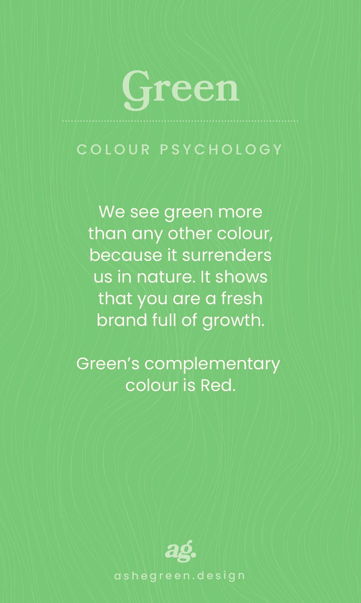
Embrace our inner green side!
There is no question that when we see the colour green in branding our mind turns to thoughts of health, serenity, growth, money, and wellness. On the other hand, we need to tread lightly here because green can also carry some negative emotions of envy.
If you are in a health and wellness niche you may want to include a green colour palette for your website and create a logo and banners that use green in the background.
The use of green in logos has been made popular by major brands such as Starbucks, Roots, and John Deere.
The colour is very on the nose for John Deere as their business is focused on landscaping, agriculture, and lawn care equipment, where green is a dominant colour.
Roots, on the other hand, uses the colour green to appeal to nature lovers and outdoor enthusiasts. So, even though the brand colour may not tie specifically to the products they sell (apparel), they have used the philosophy of colour to attract a specific target market and you can do the same.
Find your strength with blue!
What image comes to mind when you think of the colour blue? Chances are you answered blue skies or water (or, maybe blueberries if you’re a smoothie lover!). Blue is one of the most prominent colours of nature and conveys a sense of peace, strength, serenity, and prestige.
Technology brands like IBM, Dell, and Intel have all adapted to this message of strength and peace by creating products that we rely on every day - ones that are purportedly designed to give us peace of mind. Social Media sites such as Facebook, Twitter, Skype also utilize the colour blue in their marketing scheme. The driving message all of these brands are trying to convey through the use of blue is that they/their products are trustworthy, reliable, and relaxing.


Purple, the colour of royalty!
In the world of colour psychology, purple is identified as the colour of royalty. It is linked to concepts of luxury, wisdom, power, and dignity.
Importantly, overdoing this colour can lead to feelings of grievance and arrogance. On the other hand, using subtle hints of purple in your website’s design, logo, and as an accent colour in your graphics can go a long way.
Hallmark is a prime example of a brand that embodies the colour purple. They effectively use purple in an elegant font along with the crown to convey that a Hallmark card/message is royal and dignified.
FedEx uses a combination of orange and purple in their logo to convey wisdom and creativity.
Purple has a way of conjuring up images of grandeur and opulence, which may be just the right fit for your branding if you’re trying to attract customers that want to feel significant or be pampered.


Keeping it classy with black and white
Yes, technically black and white are not considered colours unto themselves - black is the absence of colour and white is a mixture of all the colours. Technicalities aside,black and white can make for simple-yet-stunning branding.
Black is considered classy and credible but can also be considered edgy, while white is often considered clean and pure. Combining the two creates a classic, timeless sentiment. Chanel uses black to convey elegance with a font and logo that are black throughout the website. creating consistency and charm. Their call to action on their website is also black which draws


Be neutral, like Switzerland
Rather than a single colour, neutrals are a set of muted colours that include whites, greys, browns, and golds that complement primary and secondary colours.
They may be understated, but neutral colours can still speak volumes for a brand. Let’s take a closer look at how each type of neutral is perceived and used by brands.
Browns are associated with eco-awareness and nature. As such, you’ll find many eco-focused and organic brands incorporating shades of brown and taupe their branding in lieu using green.
It probably comes as no surprise that golds are associated with luxury and tradition. Aspirational brands in the lifestyle and beauty industries tend to lean into golds as either their main colour or a complementary shade.
Greys are associated with mature, classic and serious attributes. As such, they tend to be popular with tech, finance, transport, and equipment companies.
Finally, whites are suggestive of youth and convey economical sentiments. White in logo design is generally used as a complementary colour and/or as creative negative space in a logo.


What does your brand want to convey?
Now that we have dived into the colour of psychology you can now apply these to your brand or business. Many businesses use colours that are common to their industry/niche, but it’s not a hard and fast rule that you have to do the same. For example, you may be in the health and wellness industry, where blue rules, and decide to go against the current with a colour that speaks to your customers’ desire for a creative solution to their wellness. All I ask is that you give some thought when choosing colours that represent what you want and what message your brand is trying to convey to your customers. And whatever you do, don’t try to use ALL the colours of the rainbow or you’ll just confuse people! Two - three colours, paired with some complimentary light and dark neutrals will do the trick!